
Columbia Men's Silver Ridge Utility Pants
A documented model family in several captured colors for comparing everyday appearance.
Consider: No thermal or protection advantage is assigned to the chosen shade.
Check on Amazonuses
A color choice is often made from a small square on a screen, yet the result has to work against dusty shoes, pocket linings, indoor light and whatever tops you already wear. Shade can influence appearance and what marks you notice, but it does not tell you the garment's tested sun rating, drying performance or insect resistance. Choose color after the model and fit, then judge the actual variant rather than the swatch alone.
Three places to start
As an Amazon Associate I earn from qualifying purchases. Purchases take place on Amazon.
A documented model family in several captured colors for comparing everyday appearance.
Consider: No thermal or protection advantage is assigned to the chosen shade.
Check on Amazon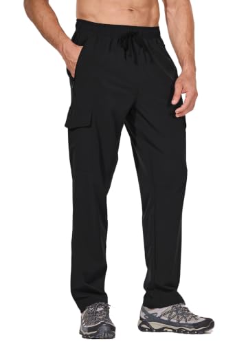
Lower-priced captured color options for a practical dirt-and-wardrobe comparison.
Consider: Color name does not establish opacity or identical stock across sizes.
Check on Amazon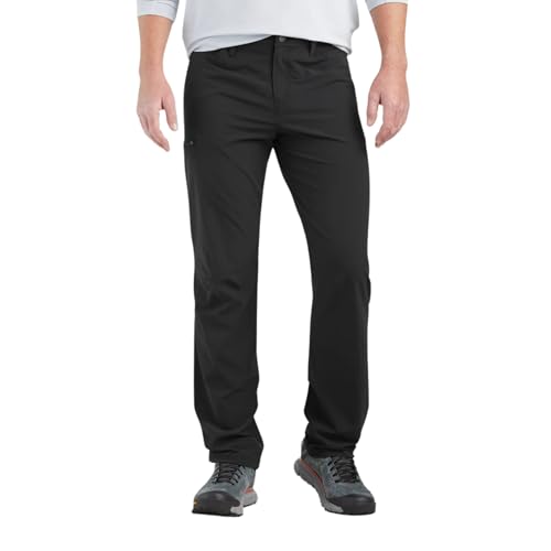
Higher-priced model option when its fit and features already suit the wearer.
Consider: Do not pay a premium expecting color alone to improve trail performance.
Check on AmazonEditorial selections from the products considered for this guide; not hands-on test awards. Budget and premium describe positioning, not a guaranteed current price.
No color hides every kind of dirt. Pale dust can stand out against a dark fabric, while darker wet marks or soil may be more obvious on a light one. Lint, pollen and dried splashes create different contrasts. Consider the surfaces you usually encounter instead of accepting a universal most practical color recommendation.
Look at your existing walking clothes and shoes after an ordinary outing. Which marks bother you visually, and which disappear into the background? You may prefer a midtone that does not create strong contrast with common local dust, or you may prefer a light shade because it is easier to see when cleaning is needed. Both are appearance preferences, not performance rankings.
Remember that less visible dirt is still present. Color should not determine whether a garment needs appropriate care after use. A dark pair can look tidy while retaining material in cuffs or pocket seams, and a pale pair can show a small harmless mark dramatically. Keep visual presentation separate from the actual care routine.
A product's named color may describe only the dominant panel. Reinforced knees, seat patches, zipper tape, belt webbing and logos can introduce additional contrast. In a technical garment, those details may be intentional design features. If you want an understated pair for everyday wear, inspect front, side and rear images before deciding that a neutral color is visually quiet.
Fjallraven Keb listings can include contrasting panel colorways, while a plain dark option may create a different impression. That does not establish different fabric performance unless the exact model documentation says so. The practical point is that two colors of a panelled design can read very differently in town even when their basic construction is similar.
Check the selected size and variant after changing the color in a listing. Retail interfaces may switch the available size, length or even the displayed product variation. A color you like is not useful if it leads you to an unsuitable inseam. Confirm the full selection again before following the purchase through, especially when a family contains several closely named versions.
Compare rear views as carefully as the front. A contrasting seat panel or pocket outline may be largely hidden in the main product photograph, yet visible during ordinary wear. If the listing lacks that view, a neutral-sounding color name cannot fill the gap. Seek another image or inspect the garment rather than assuming that the entire pair matches the small main-fabric swatch.
Hold the actual pant in ordinary light and then assess it worn as intended. Look for visible pocket bags, underlayer outlines or strong contrast at seams. Fit matters because a fabric pulled tightly across the body can appear different from the same material hanging with appropriate ease. Do not use an overstretched demonstration as a fair test of normal wear.
A lighter color may make inner construction more noticeable, but not every pale pant is translucent. Weave, thickness, lining and the chosen underlayer all influence the result. Likewise, dark color does not guarantee that every detail disappears. Check the selected garment rather than transferring an observation from another model or a different fabric revision.
Move between indoor and outdoor light if possible. Product photographs may use lighting that reduces or emphasizes transparency and texture. A small screen swatch cannot show how the garment behaves when seated or bending. If opacity is a deciding issue, choose a way to inspect the actual pair under the seller's current terms instead of relying on confident assumptions about the shade.
It is tempting to reduce hot-weather shopping to light equals cool and dark equals hot. That is too simple for a finished trouser worn during movement. Fabric construction, fit, ventilation, moisture and the surrounding conditions also influence the experience. A color label cannot provide a reliable temperature difference between two unrelated garments.
Compare similar designs if you want to understand the appearance tradeoff within one model, but keep expectations modest. A lighter shade might fit your preference for sunny outings without proving that the pant outperforms a looser or more ventilated dark alternative. The hot-weather selection guide evaluates the broader clothing decision.
Do not infer a UPF rating from color either. Use the exact manufacturer's documented rating for the model and any relevant variant conditions. A dark fabric is not automatically a rated sun garment, and a light one is not automatically unsuitable. Coverage and actual product evidence are more informative than a visual shortcut when you need to assess a sun-protection claim.
A color preference should not become a promise that insects will avoid you. Product shade, a camouflage pattern or a natural-looking tone is not proof of insect repellency. If insects influence the trip, consult the relevant prevention guidance and verify any exact treatment claim independently. Our brush and insect coverage guide explains those limits.
Likewise, an ordinary bright trouser is not certified high-visibility equipment merely because it stands out in a photograph. If an activity or workplace has a specific visibility requirement, use the appropriate documented clothing rather than substituting a vivid hiking color. This page addresses everyday appearance, not the selection of protective workwear.
For ordinary personal preference, visibility can still be a practical consideration: you may like a color that is easy to identify in your bag or distinguish from a companion's clothing. Keep that claim at its actual scale. Being easy to recognize among your own belongings is different from promising that a color makes a person detectable in every outdoor condition.
Lay the prospective shade beside the tops, jacket and shoes you already plan to wear. You do not need a new outfit for every pant color. Choose a combination you find comfortable and appropriate for the settings involved. A neutral tone may coordinate easily for one wardrobe, while a more saturated color may work naturally in another.
For a casual office or travel day, inspect how technical details appear in that combination. A dark cargo pant with bulky pockets still looks different from a flat-front trouser. Changing the shirt cannot erase the underlying silhouette. If the setting matters, use the everyday-work guide to evaluate construction and dress expectations alongside color.
Consider whether you want one broadly useful shade or a second pair with a distinct role. A lighter leisure pair and a darker everyday pair can make sense if both are used, but buying multiple colors solely because they exist adds little value. Let actual use determine whether variety is worth the space and expense.
A preferred color may not be offered in the inseam or size you need. Do not compromise a successful fit just to obtain a particular shade unless you have carefully evaluated the tradeoff. A slightly different color in the right cut is often easier to live with than an ideal swatch attached to a poorly fitting garment.
Check the care label for the selected pair and wash with compatible items as directed. Do not assume all dark fabrics require one treatment or all light fabrics tolerate another. Stain products, bleach, heat and color-restoration advice need material compatibility, not just a color category. If a mark matters, identify both the substance and the exact garment before choosing a method.
For current model examples, Columbia Silver Ridge Utility, plain Paramount and Ferrosi listings offer multiple shades to investigate, but the exact manager-selected variant controls the visible product and destination. Their color names are not standardized across brands. Stone, khaki, gray or navy can differ substantially in undertone and depth. Use the product images as a starting point and the actual garment as the final appearance check.
It depends on the marks you encounter. Black may reduce the contrast of some darker stains while making pale dust, lint or dried residue more visible. Inspect your usual conditions and choose the contrast tradeoff you prefer.
Do not assume that without checking the selected version and listing. Color changes can coincide with different stock, sizes or product variants. Reconfirm the model, material information and inseam after changing the selection.
Yes, color alone does not determine whether a manufacturer has documented a rating. Verify the exact garment evidence and any stated conditions. Do not assign or reject a numerical rating based on appearance.
If a situation requires protective visibility clothing, use equipment with the appropriate documented requirements. A bright ordinary hiking pant is not automatically certified for that role. For everyday appearance, choose the shade you prefer without adding a safety guarantee.
Choose color as the final layer of a sound garment decision. The right model, length and movement fit matter first; then examine marks, opacity, panel contrast and compatibility with your existing clothes. Let the selected variant's evidence establish technical claims instead of asking a shade to predict heat, sun or insect performance. A practical color is one you enjoy wearing and can maintain in your usual settings. It does not need to win an imagined universal contest between black, khaki and gray.